Vela
Water Enthusiast Forecast App
.png)
Overview
The project for Vela was part of a boot camp assignment. My task was to develop a solution to simplify and streamline weather reports for water sports. I was responsible for conducting surveys and interviews, researching, creating personas, user flows, a sitemap, wireframes, the prototype, and conducting testing.
Goal
The challenge I faced was addressing user frustration with the overly complex and confusing weather reports provided by companies. The information was not user-friendly, making it difficult for non-experts to understand and access the insights they needed. The goal is to decrease the time users spend analyzing reports with the analyzer tool by 30%. This will be tracked over a 3-month period, monitoring repetitive usage patterns and comparing the results to the average analysis time on other platforms.
Tools
Figma, Miro, Milanote, Optimal Workshop, Canva, Lyssna, and Procreate
Competitive Analysis
First, I conducted a competitive analysis of the major industry competitors and performed a SWOT evaluation
Strengths
-
Each has a strong and engaged user community
-
Both platforms have established strong credentials
-
Wind Finder features photos of current conditions
-
Wind Finder has had a strong presence since the late 90s
Opportunities
-
Offer user-friendly descriptions to make graphs easier to interpret
-
Organize content for quick and easy access
-
Develop an analyzer tool that generates quick, easy-to-read reports
-
Design a web app with a focus on simplicity and ease of use
Predict Wind
.png)
.png)
Weaknesses
-
Lack of explanations for graphics leads to user confusion
-
Predict Wind currently lacks a mobile web app
-
Poorly structured user flow
-
Unclear navigation to specific items
Threats
-
Other sites offering similar products such as Predict Wind, Wind Finder, and Wind Hub
-
Google AI
-
Other AI tools
Wind Finder
.png)
.png)
User Interviews & Analysis
To get a better grasp of what users need and the challenges they face, I interviewed 3 people to hear their thoughts on pain points, features, and inclusivity. Afterwards I organized the information to be able to pin point the areas that needed the most focus.
Take Aways
-
Users felt that existing apps were cluttered, with overwhelming information and no clear starting point
-
Beginners in water sports struggled to identify what they needed, due to unfamiliarity with the activity
-
The legend or key that explained the graphics was often unclear and confusing for users
-
Users had to rely on external sources for specific details, like fish population data
-
Users struggled to visualize current and future weather conditions
-
Frequent advertisements became distracting and disrupted the user experience
-
Expressed interest for an in-app or text message alerts for weather changes on a specific day
-
They were interest in having information about fish populations available within the app
-
Tabs for different sports were desired, so users could access only the information relevant to their chosen sport or activity
-
Users preferred a simple one-page recap or step-by-step guide, with more complex information housed in a separate section to avoid overwhelming them
-
They wanted clear descriptions of the data they were viewing, along with explanations of its significance
-
Including photos was suggested to help users better visualize the current conditions
-
A community chat board was requested to foster user interaction and discussions
-
Users also expressed a need for an AI-driven feature that would automatically assess and inform them whether conditions were safe, based on the available data
-
A font adjuster feature, allowing users to increase text size

Personas
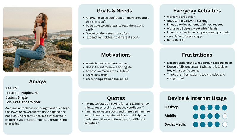
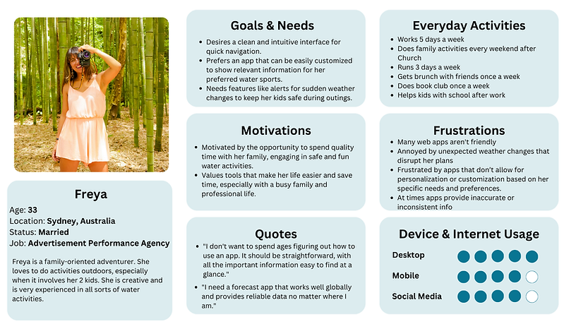
Based on the interview answers, I created two personas representing two sides of a broad spectrum. We have Amaya, a beginner in the water sports world who doesn't understand the current market reports. Then there's Freya, who is experienced and loves to share this hobby with her kids. However, she would love to see improvements that would allow her to get reports quicker and more conveniently, with extra features to keep her kids safe.
Meet Amaya
.png)
Meet Freya
.png)
User Journeys & User Flows
Here are some examples of how users can use Vela and a detailed exploration of the user flows corresponding to their objectives.
.png)
%20(1).png)
Amaya's - User Flow

Freya's - User Flow

Sitemap
After completing the user flow, I conducted a card sorting activity to ensure the most effective way for users to find information. Here is the refined sitemap.

Evolution of Vela
I want to highlight the evolution of Vela from a low-fidelity to a high-fidelity "final" product. The first three images show a progression from low to high fidelity. However, I decided to give Vela another makeover because I wasn't satisfied with the design. This is why the structure is different in the high-fidelity "final" prototype. Highlighted features include, home, community, analyzer, events, and event details.
Low-Fidelity
Mid-Fidelity
High-Fidelity (Pre)
High-Fidelity "Final"
Home Screen


.png)
Community


.png)
Analyzer Tool


.png)
Events


.png)
Events Details


.png)
Testing & Results
For testing I had 6 participants, I gave each of them 2 scenarios and 2 tasks to complete which are listed below. Afterwards, I organized on the information on a rainbow spreadsheet and giving each issue a rating on what needed to be fixed.
Scenario 1: You are a diver based in Miami, FL, who wants to meet new people who share this common interest. You would also like to make a trip out of it. Use Vela to find a way to join a meet-up.
Scenario 2: You're new to surfing and don’t want to go through the hassle of reading weather reports. How would you quickly find the information that is needed?
Task 1: Find the wind direction graph for today
Task 2: Create a post

High Fidelity - Final
I decided to give Vela a makeover because I wasn't satisfied with the first design. It felt blank and very cookie cutter and didn't seem to portray the aesthetic feeling I wanted. The makeover included: restructuring, change of colors, and updates using the feedback from testing. When sharing the updated design with participant's, the feedback was positive!

.png)
Features:
-
General forecast
-
Community
-
Analyzer tool (tailored to sport)
-
Events list
-
Saved folders
-
Detailed weather reports
Lessons Learned & Take Aways
-
Making Changes in Design: Throughout the design and testing process, I realized that I wasn’t entirely confident in the initial design—it felt too basic, lacking character and charm. While I wanted to completely overhaul the design to give it more personality, I hesitated, knowing that the prototype had already been tested and received feedback. I felt torn between implementing the necessary feedback and making the broader changes I felt would truly elevate the design. Ultimately, I decided to take a chance and make those changes, confident that they would enhance the user experience. When I tested the updated version, the feedback was overwhelmingly positive, confirming that my instincts were right. This experience taught me that when I know I can improve my work, I should pursue it, even if it means reworking parts of the design. Otherwise, I’m not serving my users or delivering the best possible experience. Additionally, I initially worried that all the effort I’d put into the low-, mid-, and high-fidelity stages might go to waste. But I realized that each stage was crucial in showing me what to improve and provided a foundation for building a stronger design.
-
Empathy for Users: I came to understand the importance of deeply grasping users' problems—not just identifying them, but truly empathizing and stepping into their shoes. It’s not enough for a designer to simply work from a checklist of issues; that approach risks losing the connection to users and misses the chance to anticipate future needs. By taking a deeper dive into understanding users’ experiences, we can create solutions that are both impactful and forward-thinking.
-
Feature Prioritization: During the early stages of the Vela project, I had numerous ideas for features—so many that they would have extended the timeline significantly. I quickly realized the importance of prioritizing the most essential features and accepted that there would always be opportunities for additional enhancements in the future. I understood that if a feature didn’t make it into the initial launch, it could still be introduced in future updates.

.png)